Painting “Komuso Monk” step by step
Author:
ANNAmain • Date: 11 September 2010 at 07:19 PM
Comments(37) •
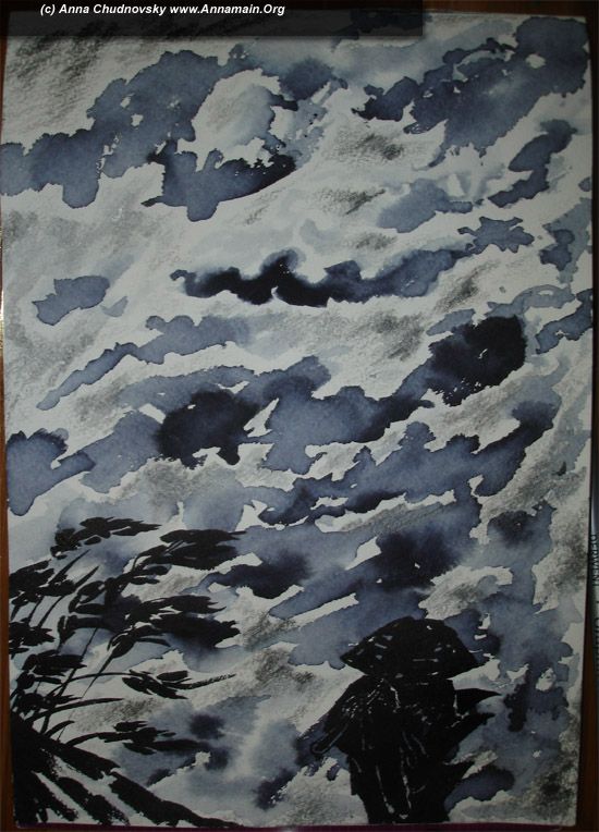
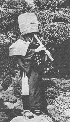
Hello everybody! Today is +20 in Moscow, so i am thaw out and ready to share with you my experience of painting. This is step-by-step description of my work "Komuso monk" and about 10 pictures you can see under cut. This is the final view.
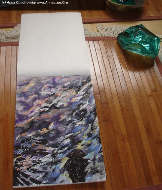
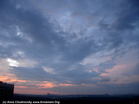
I was impressed by the dark sky with violet clouds described here annamain.org/index.php/site/comments/new_graphic_with_dark_sky_symphony/
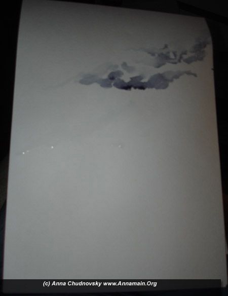
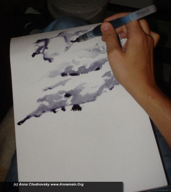
My instruments was 2 aqua-brushes with ink; one with pure black ink, and another with 30% ink in water. I used an aquarel paper A4 and several aqua pencils (Derwent`s and Gretacolor`s Aquamonoliths)
If you don`t like aqua-brushes it would be the same process to use a classical brush #4 or #5… or the size you like. I recommend to use squirrell brush because it could suck up more water or ink in one time. First of all I made several strokes with pure water to form the light tops of the clouds. Then I made the bottoms of clouds with 30% ink. If you make several strokes on one place of the paper it will be more deep color of ink. It was a bit dark on my balcony when I did it so the picture is not the best. But you can see here how the clouds setuated on the paper: with an angle to horizont. It means the wind.
While the picture still wet make strokes with pure ink. If you lightly touch the wet places with a tip of a brush the paper easily and naturally pull in the ink into the picture. You should pay attention how the dark ink distributes on the clouds to make the best shape.
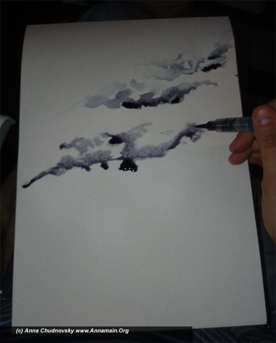
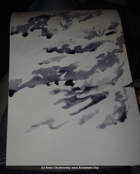
An aquarel paper with rugged structure has own possibilities to interact with water and ink. So you shoudn`t afraid of water`s drops and only check how the ink spreads on the surface. Use pure ink, 30% ink and pure water to form different colors of clouds.
Here you can see how brush strokes creates a vision of cold dark clouds and wind. There is no needs to finish every cloud with the same strokes. If a wind is strong it tears clouds. Take care to paint clouds in different angles to each others. It makes picture a natural view because as if you see the scene from the earth.
When I had finished with clouds I painted several culms of a grass at the left corner. I did it with 100% ink over the clouds, so it`s importand to make clouds dry before painting.
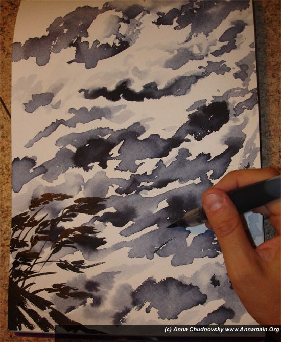
The figure of aKomuso Monk was made with pure dark ink too, the same way as the grass. The angle of clouds haven`t the same as the grass because clouds are far away. But the direction of the wind for the earth objects is about the same. So the grass and monk`s clothes flutters together. In that point you could finish your work as a monochrome picture. I desided to go farther and input several colors.
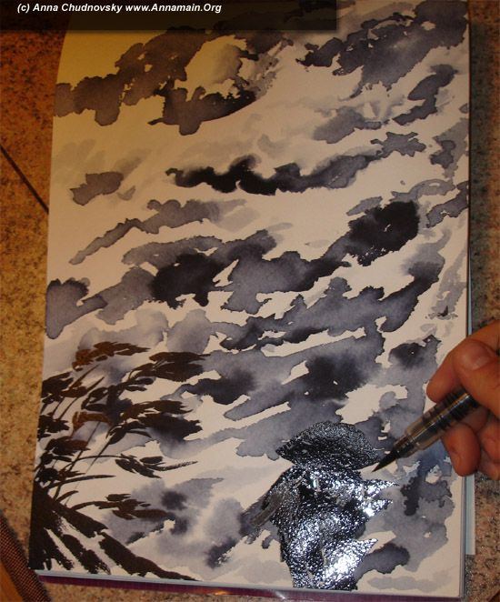
You can see a blank white paper between ink objects. I started with a pancils to make white holes deeper.
Light apricot and several shadows of blue aquamonolith pencils - this is my choice for that picture.
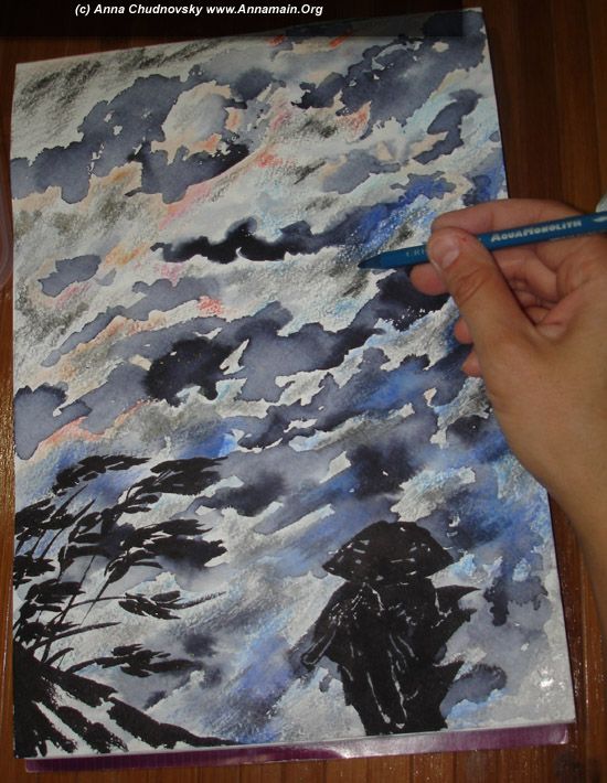
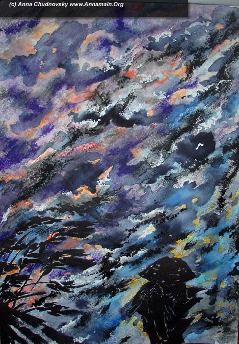
After drawing I washed out pencil`s strokes with water brush, made picture dry and made a durk dust with the pure ink. It seemed right to made several strokes with yellow pencil and washed it out the same way. White points was made as a last act… So the picture was completed. May be it will be one of the parts for next big acrilic painting.

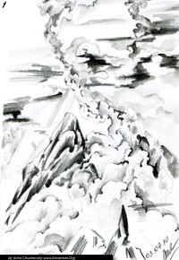
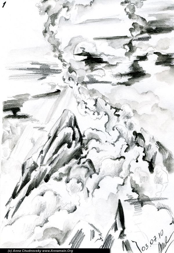
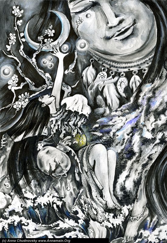
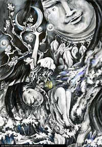
 That seria represents the way we growth our personality and soul - by ourselves or as circumstances dictate. Even if it is hard (usially it is!) there is several points to have a rest. After mountings it will be a plateau. We fill it as not a paradise and not a final point, but something misty, unclear and afflictable… but also standing. After a hard ascent without any point for rest a plateau feels different.
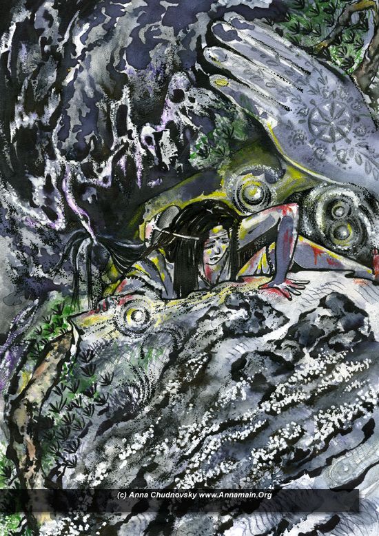
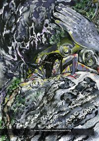
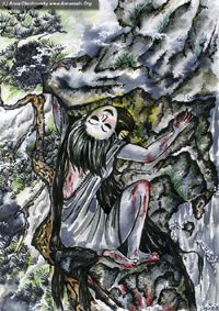 The picture includes Chinese style painting and represents… You can imagine anything from own associations, it may be symbols of soul teaching or rememberance about a hart time in own life. From my side it is both position. It shows my today depression and feelings of present moment and also have a symbolic meaning. The great advantage of paintings is possibility to show everything in one A4 paper you can observe by one glance. This is why I practice it all of my life.
 The main idea of it is the cycle of spiritual birth and death and the way to escape it. What is the Festival? It`s may be different for diferent people. One selebrates birthday, another - re-births, or the final salutation such as glory death in samurai`s codex.
 Ideas of movement, how ideal idea could embodys to the solid forms, the process itself - this is my investigation and feelings. Step by step, from quiet statics, so fine and hardly perceptible has it`s own desire to be exist among people. Step by step it percolates through the everyday`s noise to something new, visible. I can feel it before I`ll give my brushes and instruments, choose paper and start to create. Before the first stroke I concentrate to the ideal form, Idea itself, then I must see it through the paper and like under it and then stabilize the image and start to work.
 And big size: