Master Class

How to jump from old level to new one? -1 step
Author: ANNAmain • Date: 20 November 2013 at 12:23 PM No comments

Dear friends, today we meet one of the most important problems on modern world. How to predict new step of development and how to jump to it? That process consists of 3 steps. First of all is to recognize features of the position you have.

Our world develops so fast so we need to predict nearest future before it comes to us. Sometimes it is easy because everything in the life looks unperfect. But when we gain a stable position is is not so easy to realize it will be not so perfect to gain desired future.

My example illustrated what is it.

IN my previous work everything was clear. I have Bamboo Cabinet for ink painting and thinking and Yoga Palace for big painting,  everything was arranged and good for creation and productivity. Just go and do it. It was ready every time I wanted. This is the example of good stable position for today; so good so it really works. It fits to design of my home being aesthetics.

But when I have a glance to nearest future I can see the nesessity to make more then a good product (painting in my case). I need to make films about everything: how my painting growth, what a psychological effect it can support, also to allow people to learn from me things really works for good by many years of coach experience so to use my ink drawings as illustrations. This is the future I want. This is the natural perspective which combines all of my skills from previous experience and allows me growth more.

 
This is the first step to your future: to realize what`s your background, your feeding idea, your core experience and how to develop it to the next step.
 
What is the problem doing it?
I see the one problem here: to realize tomorrow comes and brings changes anyway. When you realize it everything comes naturally.
 
Sometimes people try to broke today stability in order to create future. It is right in case today isn`t good. However in situation today is good quality and brings your energy you should just have a glance how to develop it to more. To growth it naturally and to allow it to blossom. To create possibilities to others people by things you gain now.
This is the first step so if you like the idea you can observe everything around and ask it what is the ready-for-growth potential.
 
Thank you for being with me!
      
                                   Anna
Master Class: Let your Intuition Flower Blossoms
Author: ANNAmain • Date: 29 December 2010 at 06:22 PM Comments(2)

Intuition seems as something strange for many people. They listen about intuition from  doubtful sourses told about instrument to "predict" and listen crazy voices and seemed mad in behaviour. But true intuition is something else!

It`s the part of everyone`s mind! Behind narrow territories of rationality, highter the instincts and subconsciousness this is the great area of  illuminate mind, lighting, the place of brilliant ideas and epiphany, place of deep relaxation and happiness. We all needs it is our time of information`s pressure. Everyone could feel the area of Intuition without a fear to lose rationality.

Several ways helps us to make a gentle touch with intuition; such as true love, music, dance, meditation, action, religion wich you could understant and feel by your own experience, arts. Intuition strongly connects with water and all symbols of wter, it`s one of the base structure of our nature both phisical, psychological and also spiritual. I would like to invite you to that Master Class and to use painting as a power to open slightly your intuition.

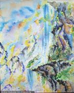
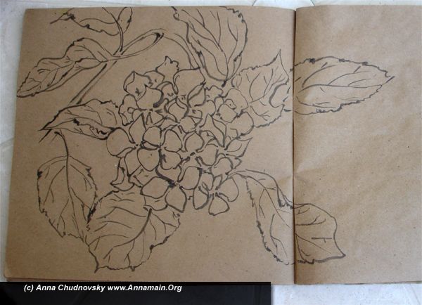
Well, tht time I want to found why I choose the way of painting. First of all our base mind stands on images, words and logic develops more later. Watercolours is the great symbiosis of light (colours itself), water (our base substance) and action. If you paint with music it becomes a dance. So this is the best way combines all importnt things. This is no aim to paint a real flower, but a symbol of flowers generally, with colours you choose by your intuition, at any form, with all details you feel. Ok, let`s it blossoms!

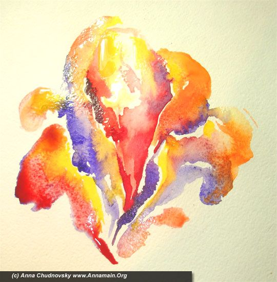
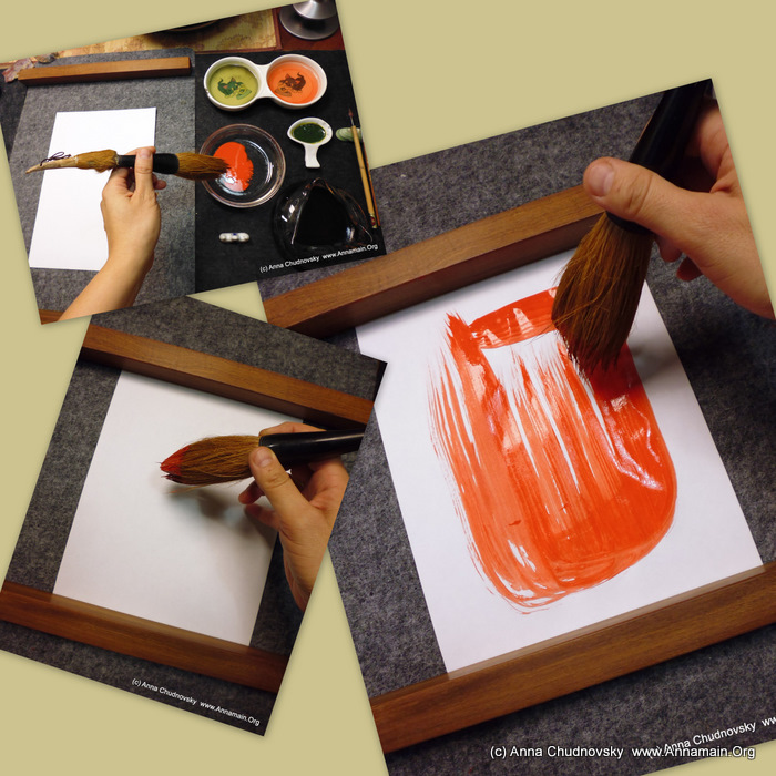
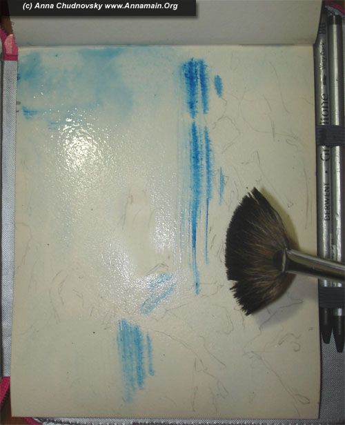
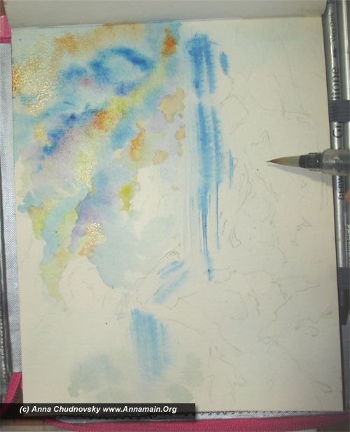
1 - as a pearl starts from only grain, a flower starts from a central petal. I choose red colours for it because it`s the best to enter all another colours. You don`t have to create an accurate shape. Let water to provide the colours free.

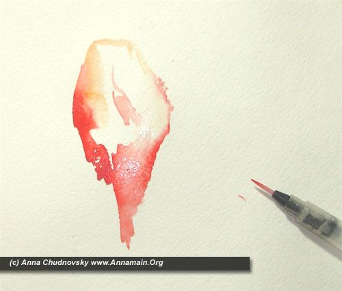
2 - use more water and enter another shadows of red to the petal.

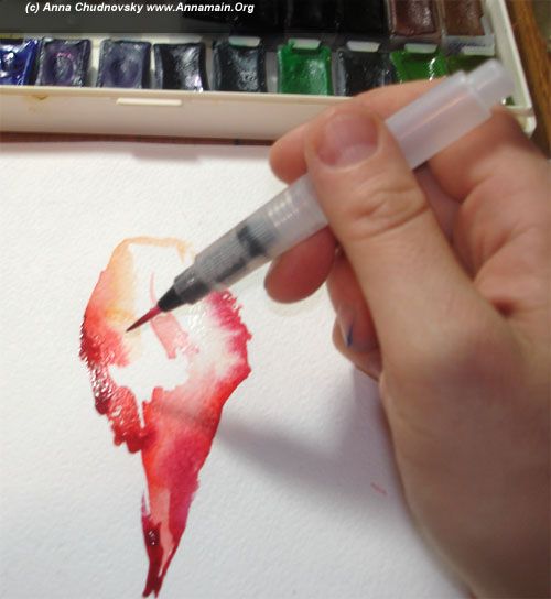
On thet picture you can see how different shadows of red layes ton he paper, how water dissolves or concentrates it. Pay your attantion to provide your painting with water, more water as you can see on the picture.

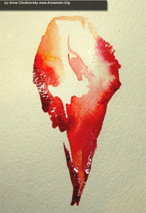
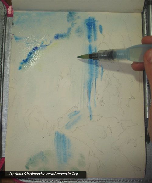
3 - use another colour (for example violet as I did) to paint a brranch petals. Technigue is the same, actually this is no technigue except ‘more water’. As your paper has more relief you can use more water. If you use a water-brush it`s more easy, just squize it and enjoy the result. If you use a classical brush you should bring more water on it.

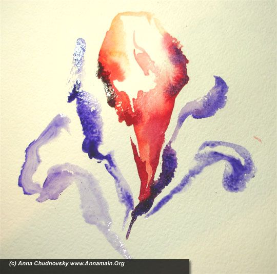
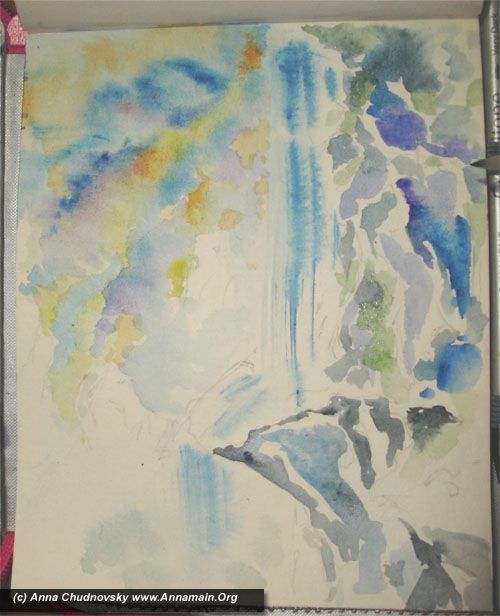
4 - introduce more colours in your picture as you see on the picture.

5 - more yellow light colours. the point is to feel it, how it fade away, how it mixes with another.

Let youself to relax. The paper and water will do everything b itself, and you will be a witness of the process. Feel relaxation, feel the process itself, forget about result!

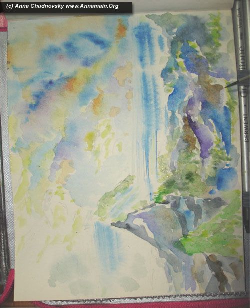
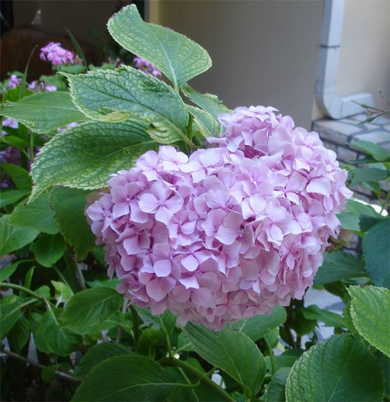
6 - create leafs for your flowers. My intuition recognize my flower as somethinf narcissus so my leafes is sharp and long. Listen to your intuition and paint the shape you want with all colours you want. This is no limitations. But feel everything you want to do, feel it during the process and use enought water.

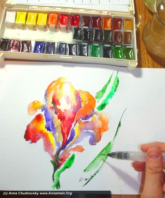
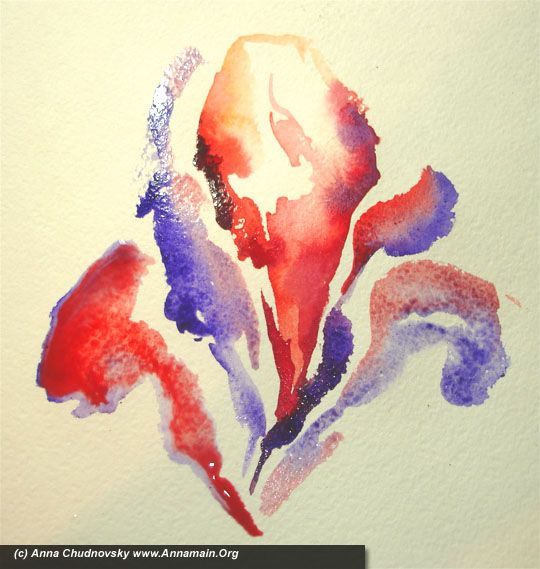
7 - more leafs with different colours! Let youself to relax. If you feel a desire to drop your brush and paint by fingers - do it!

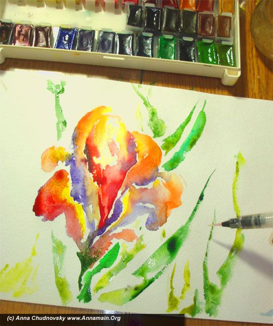
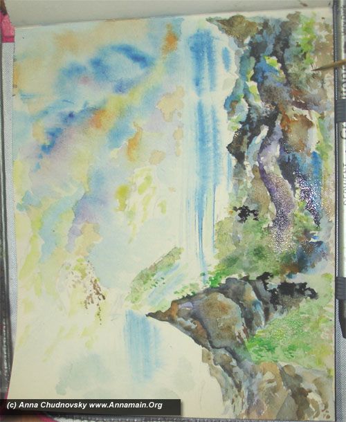
8 - until your colours is wet create more buttons or flowers as you wish. That way everything is possible, everything is right. Do it until your picture is wet, use more water and feel it, feel it, feel it… That way your intuition becames contrillable and availiable for you without of rationality loses.

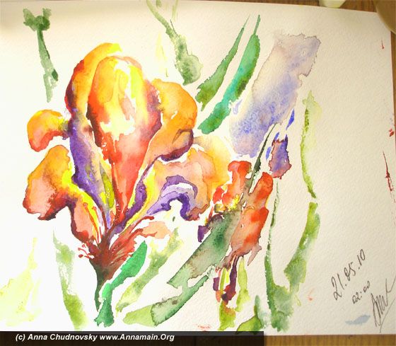
When your picture becames dry  you can feel how something fine disappears with water.  With water you can literary touch the space of possibilities and change everything, but dry picture becames a history, a fact of the past. As you feel the differencies between such two states and place both to your experience you can be a master of intuition and rationality both. This is the true gift and the real result of that Master Class.

If you are wondered what is the reason allows me be  sure how to use rationality and intuition both you should read some facts about me here   annamain.org/site/annamain/  and here annamain.org/site/facts/

I can prove my position by own experience and I feel this is my destiny to teach how to make both ways with double advantages availiable for every person wants to develope. It`s possicbe and could brings your fresh energy, relaxation, better decisions, better quality of life.

Try it and good luck!
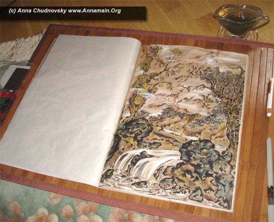
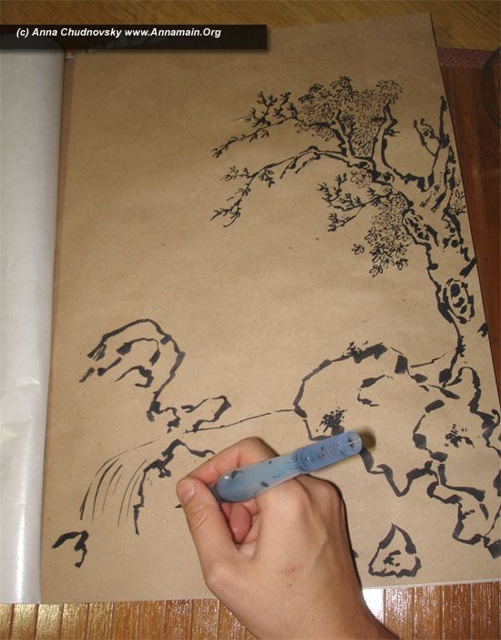
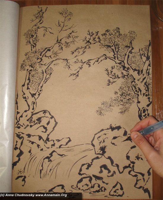
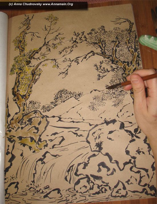
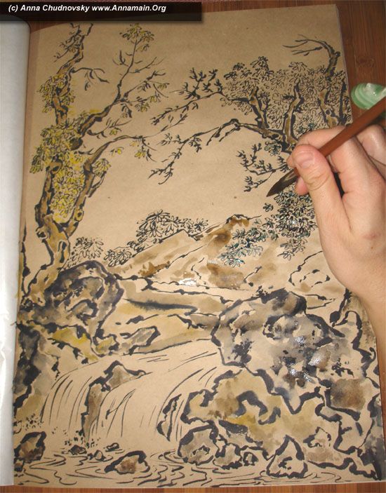
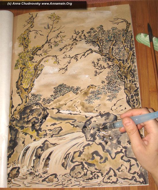
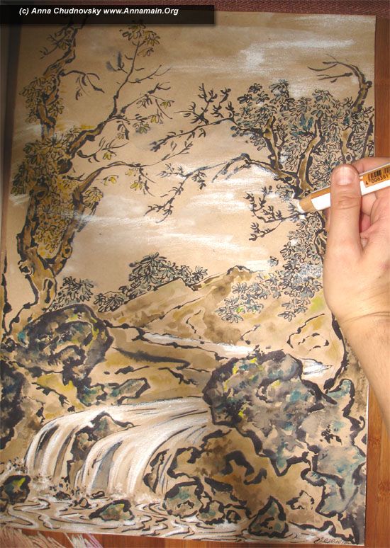
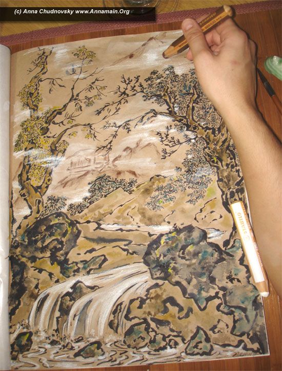
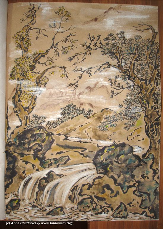
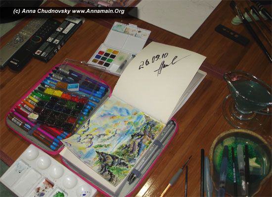
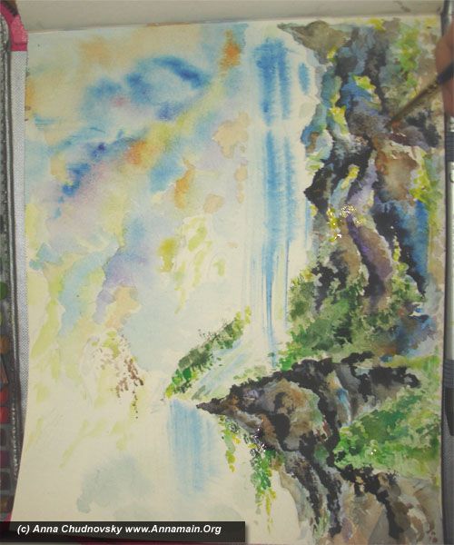
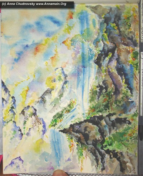
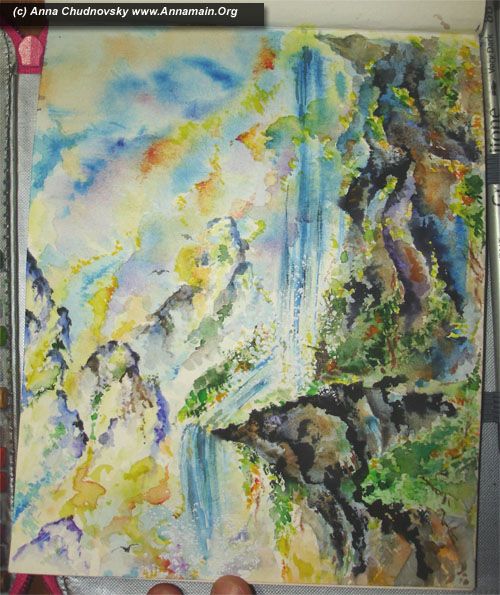
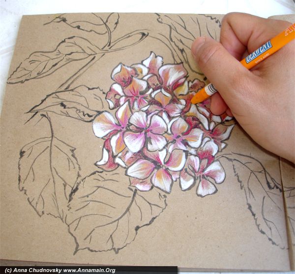
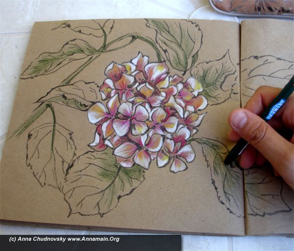
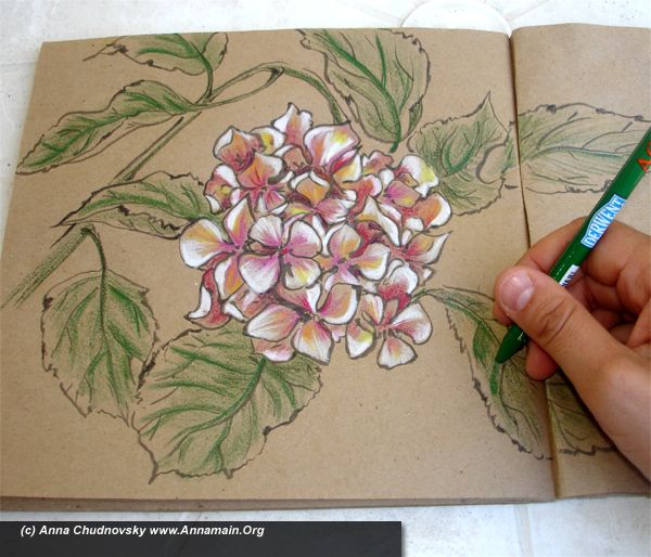
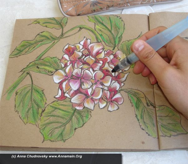
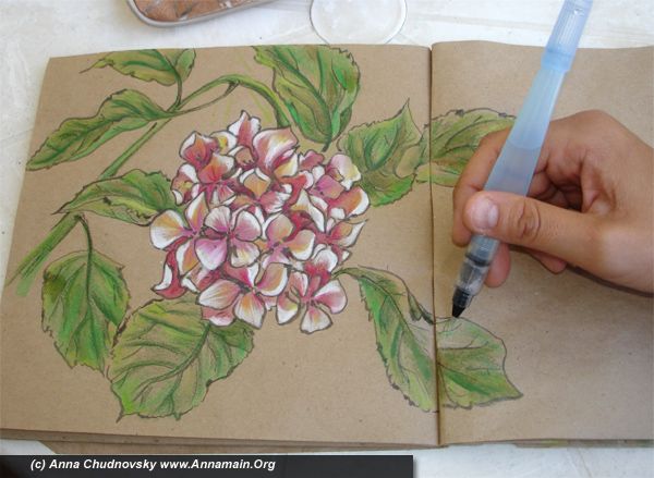
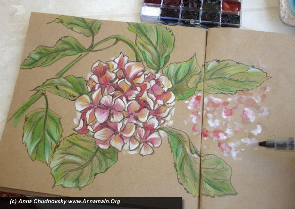
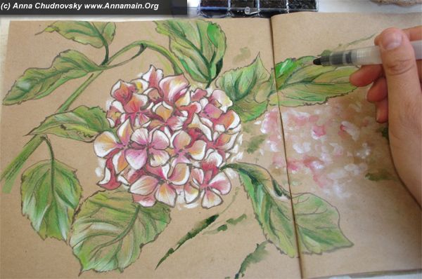
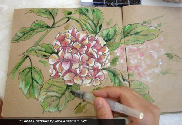
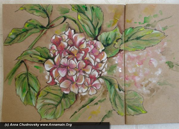
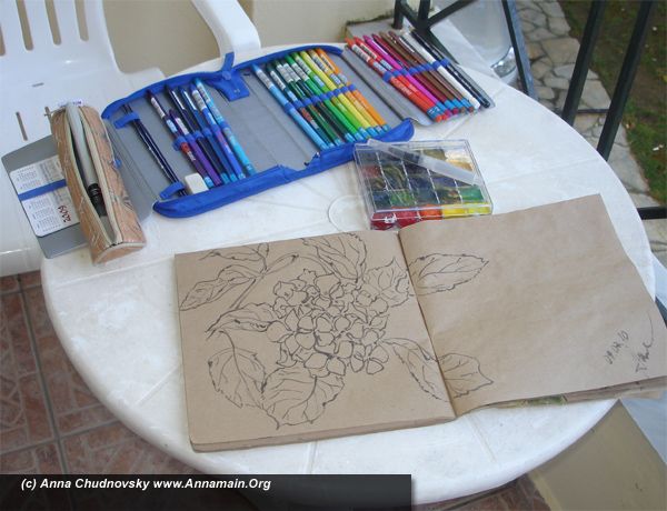
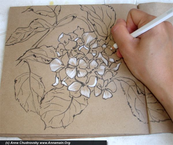
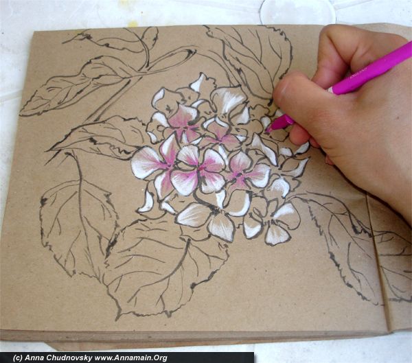
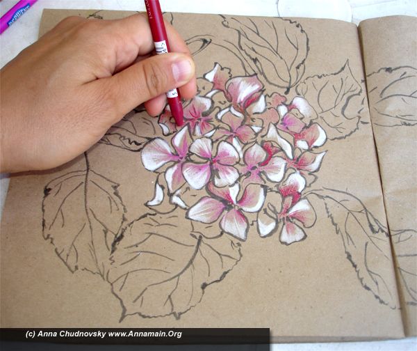
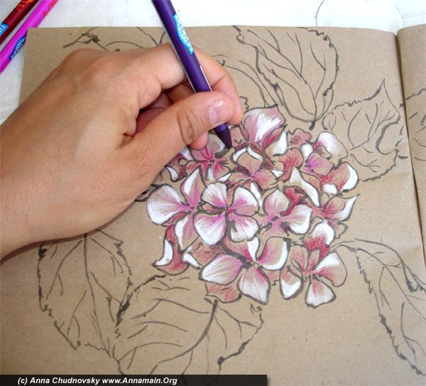
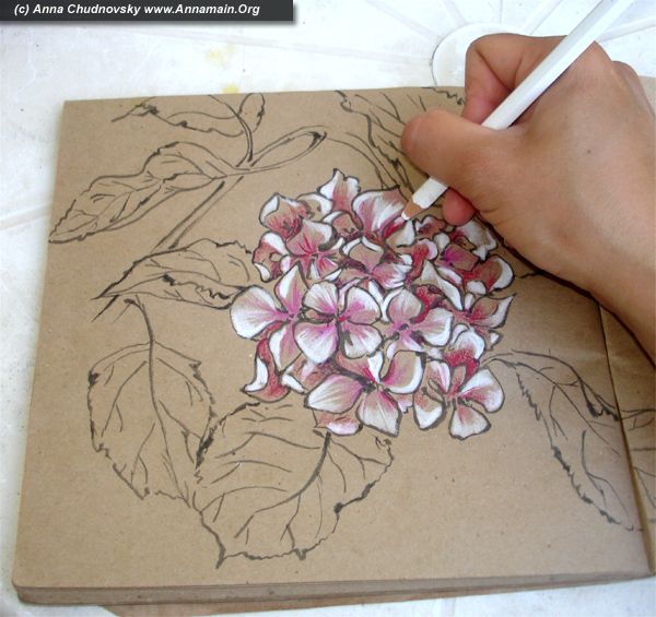
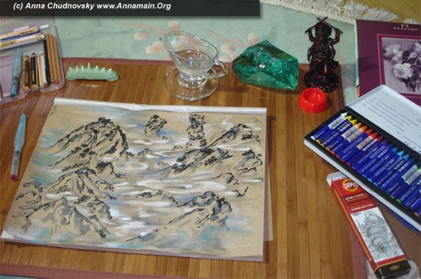
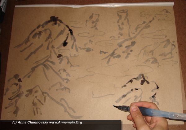
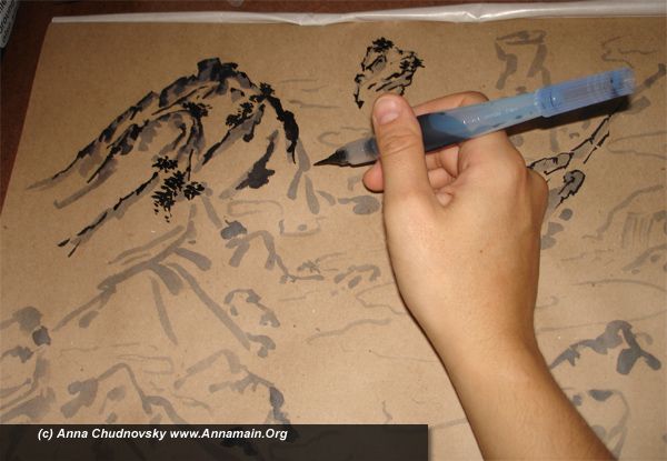
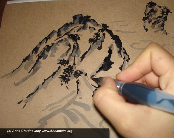
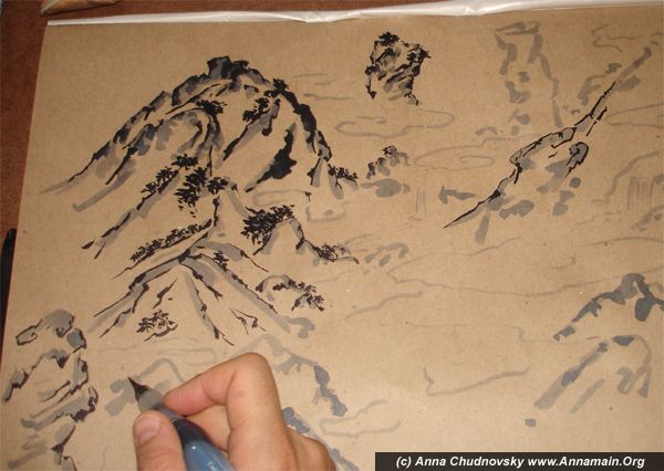
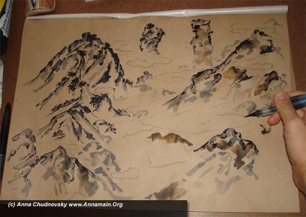
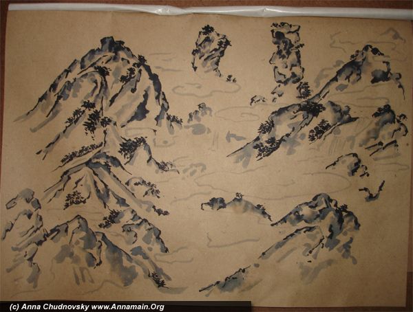
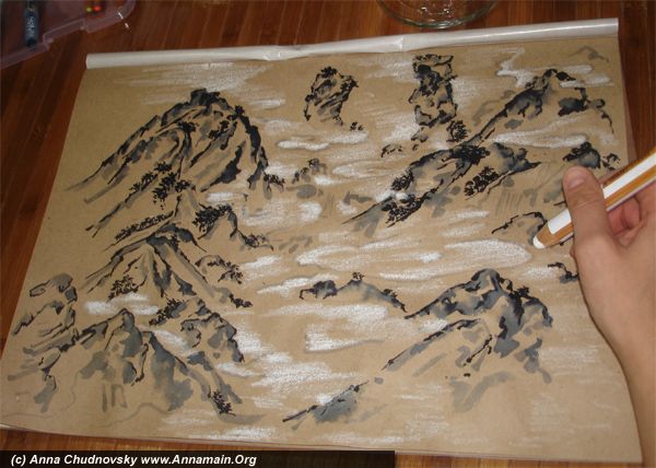
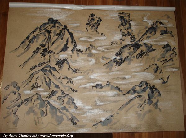
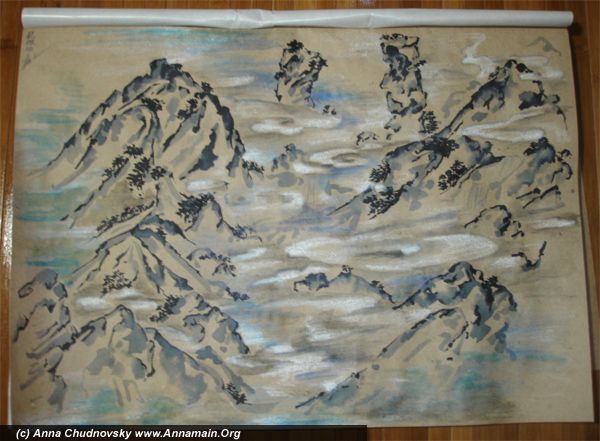
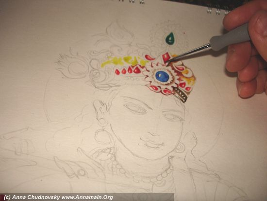
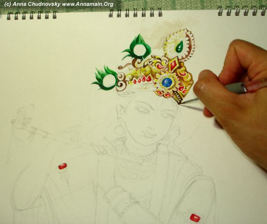
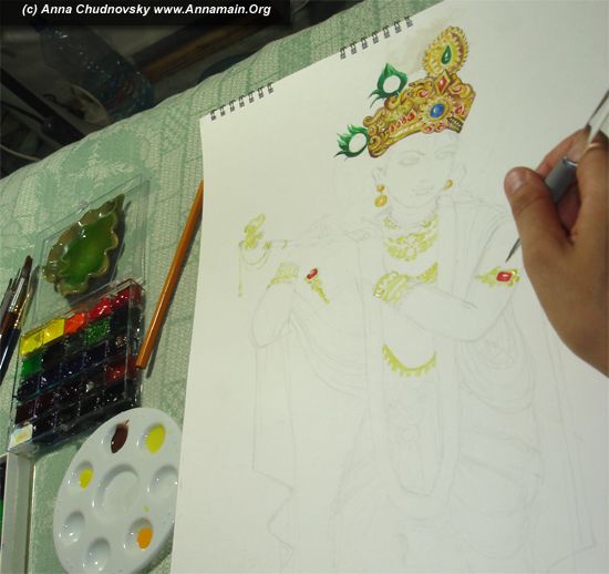
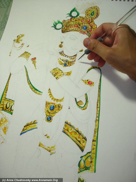
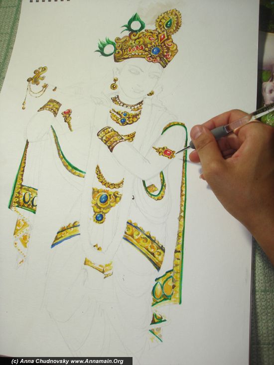
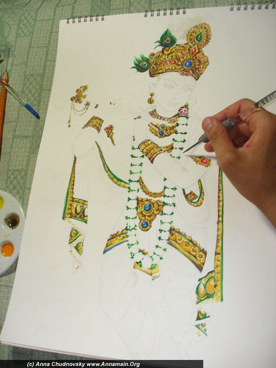
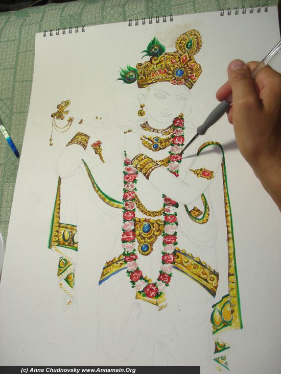
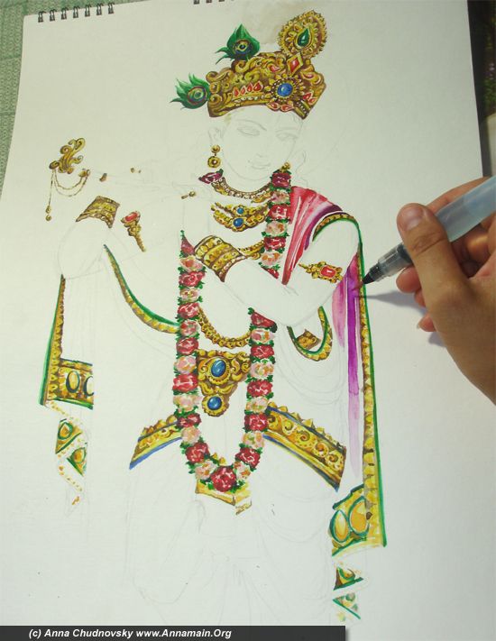
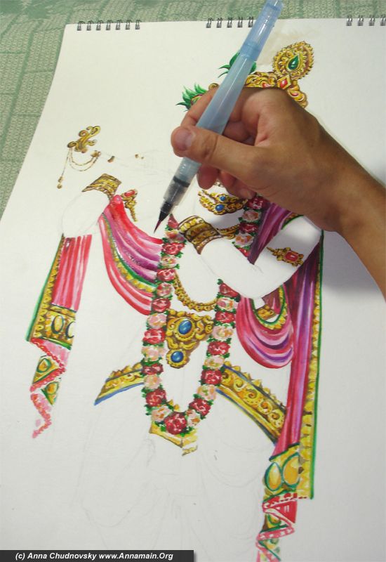
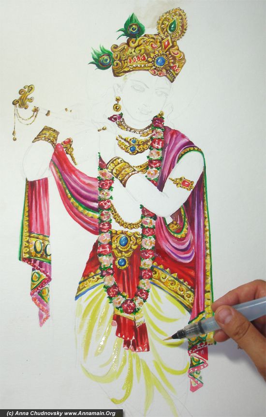
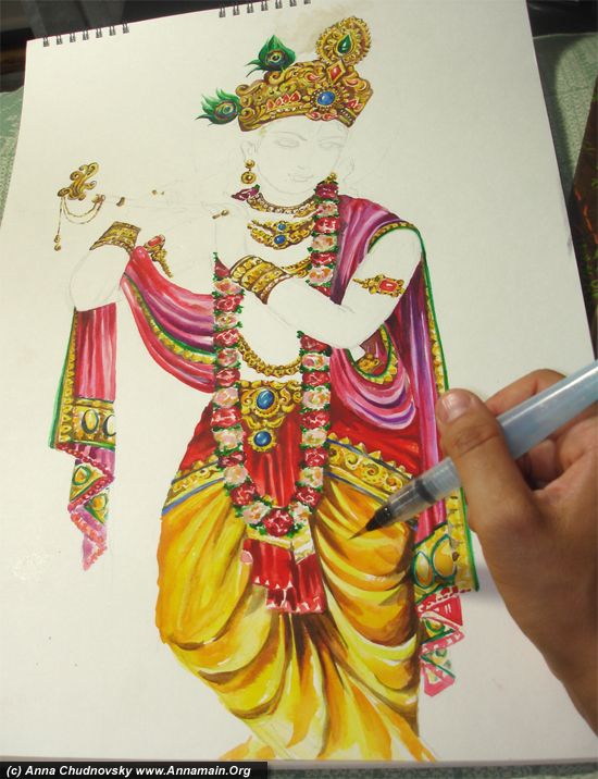
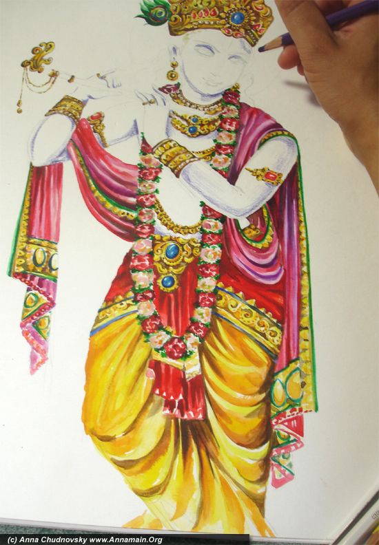
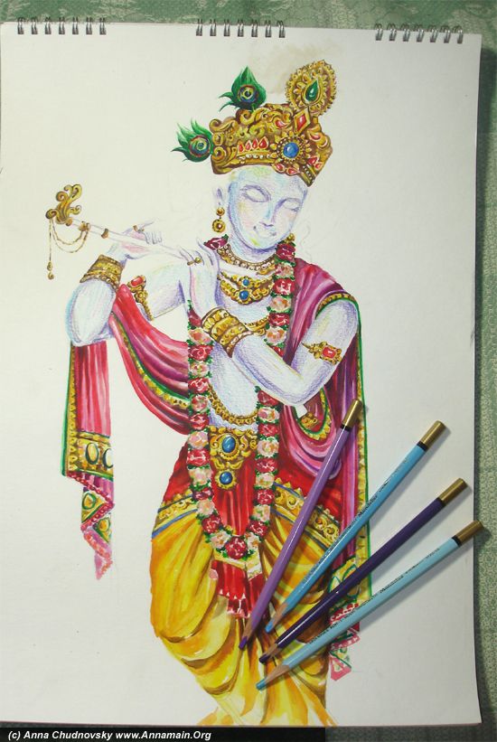
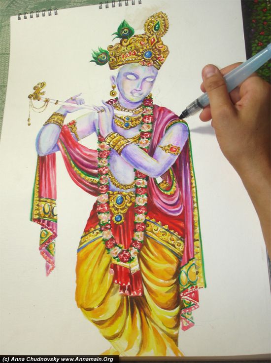
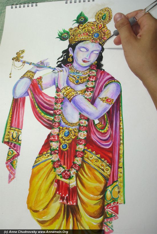
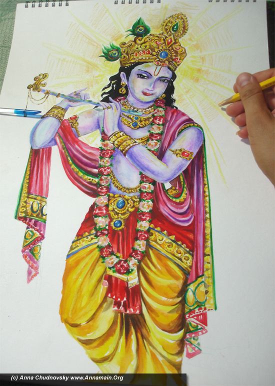
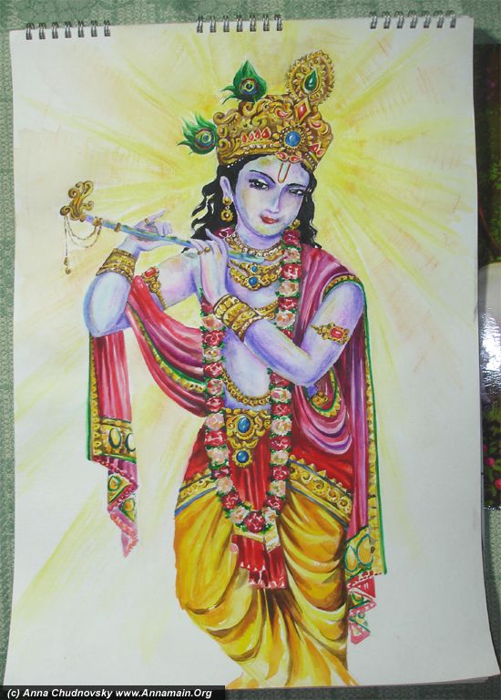
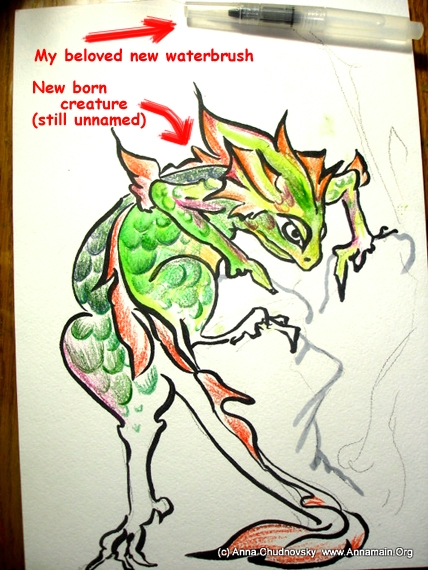
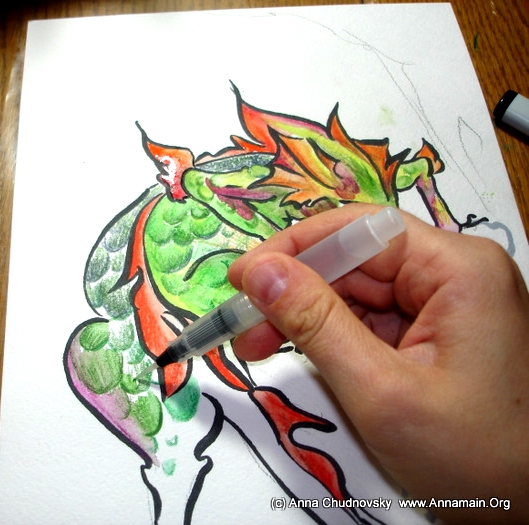
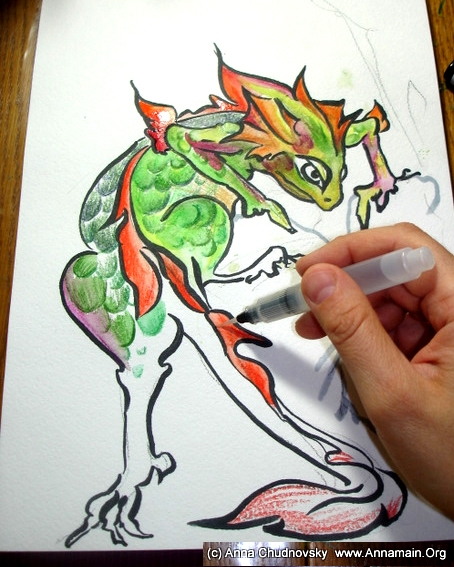
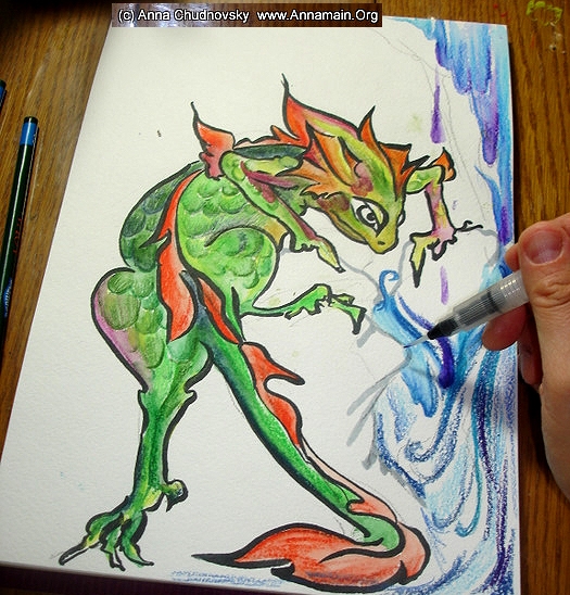
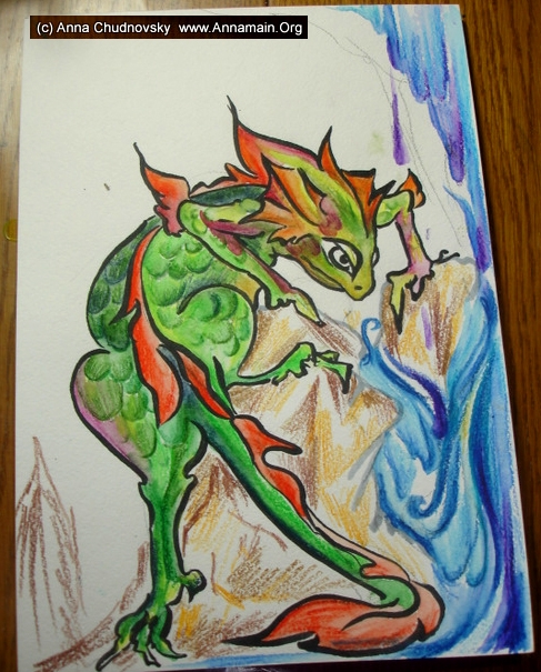
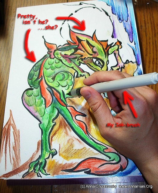
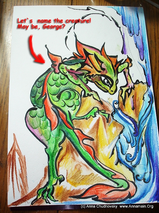
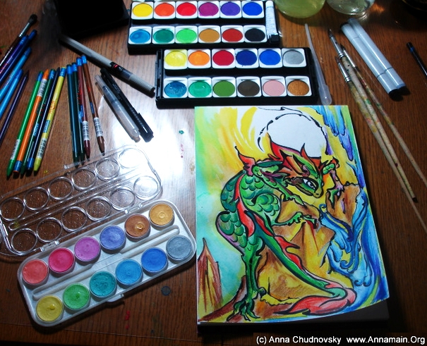
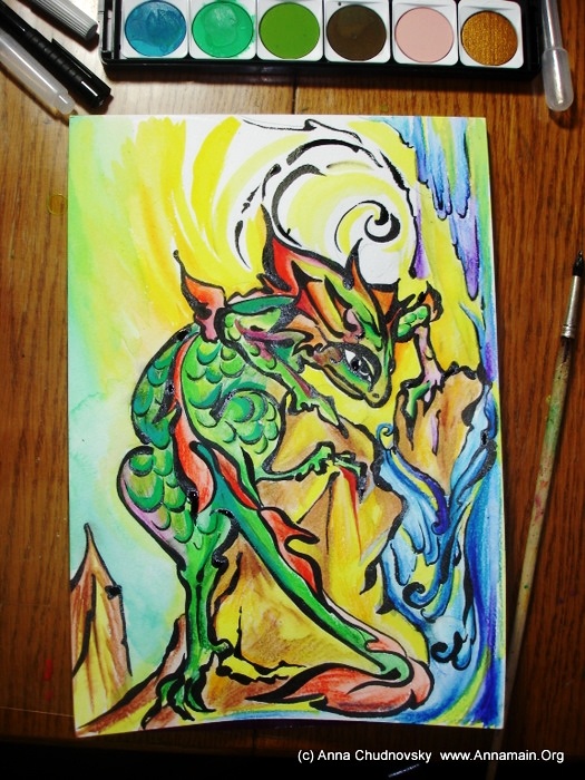
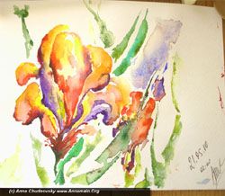
Feeling the Balance: Gohua Mountings #5 step by sep
Author: ANNAmain • Date: 11 December 2010 at 03:14 PM Comments(3)

Today I would like to explain a very important thing both in painting and in the life. This is the same  thing allows you to drive bicycle, to become more experiencied and wise, also to be tolerant and patient, and to finish sucessfully all projects you start.  I mean the feeling of the Balance.

In Eastern tradition from kung fu (I studyed Wing Chun Kung Fu for 8 years) to crafts (I studyed it in Chinece style embroidery) such fine feelings is the key for perfection. In Western tradition the same feeling is important in business and management, especially in mediation  process, also in communication. If you read more about religions, you`ll realize then many religions means balance of life and emotions as the way to meet God.

  I agree with all cases with indorsement of my own experience. It`s not easy to explain it by words. But that picture in Gohua style is the possibility to feel what exactly the Balance is. As you can feel it painting the picture you can feel the same in other fields of your life.

1 - by medium brush with black ink paint a big stone and a group of several smallest one. You can do it the same way as mine  but it is better to create a different shape. You don`t have to imitate my lines and strokes but try to feel another from your own soul. Do it, feel the Balance while you paint it. The Balance directs your hand to make thin or wide strokes.

2 - paint the shape of a tree the same way you did stones. Feel before you paint. If you feel worry about the right shape make a sketch by pencil and then paint the lines over it.

3 - paint the crown of the tree and another bank of the river. The crown consist of many small leafs with a simple shape.

4 - paint the second tree, stones under it and then make details for stones. It doesn`t matter what a progression of details you choose. Start from point you like. As you feel the Balance as a harmony between everything on the picture, you will do it perfectly. The feeling is the principal part, and moving brush and shapes are the second.

5 - create details as you like for perspective and then start to paint out the picture. If you use water-resistant ink you can paint over lines. Else try to paint out carefully as I did (actually I didn`t think about it until I coloured the picture, mia culpa!).  Use brown shadows for stones,  trunks and yellow colour (or another as you like) for crown of the trees.

6 - Add gray colour for stones while it`s still wet. Feeling the Balance paint out details on the back. Use dark green colour for the crown of the right tree and bushes on the back.

7 - feeling of the Blance means you can feel the harmony of whole picture. So it`s important to make mist by white colour or charcoal and use all paper for it. If you use white paper for painting you can paint the mist by gray or another colour you like. By white charcoal or colour paint the waterfall.

8 - make the mist more thick. Make strokes the way you feel right.

9 - by brown charcoal or brown colour make a house on the middle and a mounting on the back. Add several strokes for mist to make it more thick.

10 - observe the picture and feel youself. What is the harmony? Feeling the Balance you could create something different from my picture, this is very good result! Also you could use my picture as a conductor, may be as a benchmark for your own experience.

To resume that lesson I have to notice advantages of pre-feeling. As you try it you can train it and use in many fields of your life. This is millions results coused from one reason, the feeling of the Balance, Harmony . Try it!

Good luck! smile

Waterfalls in Mountings - the gate to your intuition
Author: ANNAmain • Date: 22 November 2010 at 06:57 PM Comments(1)

Today in our on-line class you can see how to paint waterfall in water colours. As you do it you could feel something fresh in your soul, the voice of intuition. Water is the way to it.

The great gift of the painting is to create bridges to your subconsciousness, to waken your creation. So I avoid to instruct you what colour exectly your need to create the same picture as mine. Be sure I can`t remember it because creative process is a pure meditation for me. And I wish to waken your to it.

First of all make sure your place are comfortable and it`s enough place for everything - your hands, brushes, water, colours, for everything except your cat.

Cats always interesting in painting and tryes to use their tails and pads as brushes. As we likes them this doesn`t sounds as a problem, but be shure: a cat likes to finish his master work somewhere on your bed clothes or business shirt. Anyway mine did it many times and I have to warn you! smile

1 - use water to make a paper wet. By brush with ablue colour and a lot of water make several wet strokes to make sky. Then with dry brush take more blue and make strong strokes -this is the stream of a waterfall.

2 - you are free to use any colour you like for sky and clouds, but try to do it quickly until your paper keeps wet. Take  dark blue to make several strokes as clouds. Then use any light colour (yellow on my picture) to make several strokes near the previous.

3 - Keep paper wet and make several strokes with different colours the same way. Keep your brush away of waterfall.

4 - you can choose any shadows to paint the rocks. I chose shadows of gray and dark blue, because I like it for mountings. As you like to paint another way, for exmple with shadows of brown, you should choose it and the result will be good. By several shadows of choosen colours make strokes for mountings.

5 - use several shadows of green to create the base for future grass. I prefer to make instructions the way to turn your intuition to communicate with you.

6 - use dry brush with different colours to make grass and mountings more thick. Feel it. Your subconsciousness keep every plant and stone you`v ever seen and as you feel something- do it! By points and strokes make the picture lively. Feel how water falls, and rocks stands… see as point by point your picture became manifesting.

7 - the same way  make points and strokes with dry brush.

8 - with points by dry brush and colours make far mountings on the left side more clear. Use orange, yellow and lemon yellow coours to make several points on the grass at the right side of the picture. The same colours you can use to make chains of points on the clouds.

9 - use white  colour to make points represents spray of waterfall. Point it everywhere you feel right!

10 - the last step is to allow people to see such beauty. Two small dark silhouettes near the waterfall let us to feel the picture better.

Well, this is the end of the picture, but may be the beginning of your great travelling into intuitive knowledge. As you feel it try to relax and be in silence, be in consciousness, be waking, be a witness. This is the gift and the way to open youself for more colourful, more light life.

God Bless you.

How to draw hydrangea flowers, part II
Author: ANNAmain • Date: 11 November 2010 at 10:35 PM Comments(1)

Ok, this is the last part of the master-class and now you can finish the picture to the complete result:

Our last master class was finished on the 7 step- "by white again make smoother the edge between white ends of petals and another colors".

Now it`s the time for magic and our colours will be different. The way of colours from the one tint is the shortest way to create a  boring picture. As you want something impressive and live you should mix  colours with your emotions and feelings.

Now then it`s the 8th step - use orange pencil to create sun spots on the petals. Let the picture be impregnated with sunpower. Feel how the energy of colours flows from your fingers to the paper. This is the real power we need to live, and flowers need it too. So draw it!

9 - use yellow pencil the same way.  As you do it the picture becames radiating, it starts to send out the sun and that way picture becames interacting with onlooker.

10 - that time we starts with the leafs. Use dark green pencil to draw the leafs as you see on the picture. It is easy but the point is to make strokes along natural streaks of leafs.

11 - use medium green colour to make the streaks of the leafs. Press the pencil a bit more then in 10 step.

12 - use yellow colour to make several strokes on the leaf and if you used aqua pencils then use waterbrush (or brush) to water the whole picture.  Do it carefully on the directions of the strokes.

As you see water make the picture more bright. If you use your brush carefully all strokes will keep it`s directions and the picture will look natural. You can finish on that step  if you like it smile

13 - now it`s the time to draw hydrangea`s environment. It creates by several smears of aquarel (watercolors) by a brush. Several spots of pink colour, several of red and more spots of white and our eyes starts to discern another cluster of flowers on the back of the picture.

14 - make several long strokes by brush with white aqua colour for the leafs. Several long strokes with green colour creates the leafs on the back.

15 - the final step is to create the illusion of movement. Make several short strokes by brush with dark green colour…

...and several short strokes by brush with yellow colour as you see on the picture. Trust to your own intuition and feelings more and your result will be the best.

Now the picture is completed. The main idea is to get over the recommendations and instructions to your own feelings. This is the key for all creativity. You can use instructions on the beginning but carefully feel your own perception.

The moment you feel the energy is the gate to your own way, and creativity flows free and your consciousness  spreads  to the world, silent world without borders,  full of energy, music and magic.

This is the way of balance, peace, and the way to feel God - in your picture, in nature and in whole life.

How to draw hydrangea flowers, part I
Author: ANNAmain • Date: 10 November 2010 at 05:00 PM Comments(5)

Hello everybody, today for my on-line school I`ve prepared the lesson about flowers. It`s the best subject to remember holydays (that picture I made in Liapades, Corfu, July 2010) and to make something like therapy by colors.

The first step is to have a glance to real flowers. As you have a pleasure feeling about it it will be the best base to feel the same during drawing. This is the hydrangea I drew, and you can use any another pictures or own remembrance.

2 - draw by pencil or brush a group of hydrangea flowers you choose with several leafs near it.  Try to feel relaxation during the process.. it`s really easy: 4 simple petals per flower. You can also use that picture to copy and than to coloure it.

3 - Paint out by white pencil (or watercolor) the ends of petals as it showed on the picture. If you draw on white paper use light pink color instead white.

4 - good news! On that picture you can use all colours you like. I choose dark-pink  to make the centre of petals.  Don`t worry about result, just do it. The point is to make strokes on the direction from centre to end of petals.

5 - By dark red color make several petals more lively. Not everyone but several, you can choose it using own intuition.

(On that picture I drawed by left hand, it is more comfortable for me but is not important for the picture. Use your hands as you like smile )

6 - by violet color make gaps between petals deeper. It`s a mistery how different colors creates the picture you can recognize as natural. So you work with colors is a kind of magic! smile

7 - by white again make smoother the edge between white ends of petals and another colors. That way you can feel better how to create the volume of hydrangea, do it the way you feel and enjoy the result.

Ok! That step is the final for our first part master-slass. Next steps will be later.

I would like to help you to feel the deep reason of such therapy and to suport your attempts to use intuitin and creativity. Also you can make it as a kind of meditation using deep breathing and music. As you do it pay attention on lines and colors only, forget anything else, create a flow of movements… this is the way to remember not only one hydrangea flower, but all flowers you`ve ever seen. Relax… Releaf youself. Let it be. smile

How to Paint and Meditate mountings in Chinese Calligraphy style
Author: ANNAmain • Date: 05 November 2010 at 12:07 AM Comments(18)

Hello dear friends, today (actually tonight) our subject is how to paint in chinese calligraphy style. Being a Capricorn I strongly feel mountings and water so this is the reason for  paint it more and more.

This is not the task to create exactly the picture as you can see it in my example. The point is how to feel the way of brush and ink, to control the movement meditate and enjoy the process. As you feel better your mind will became silent and peaceful and so your picture naturally, spontaniously will flow from your finger to a piece of paper. This is the real treasure of such painting with deep blessings for your body and soul.

The first step it to create mounting shapes with light ink. You can use 1 part of black ink and 2 parts of water as I did, or another proportion as you like. With free light movements create profile of the mountings as you can see on the picture, or may be another shapes as you like.
 

2 step - with black ink create cutouts of the mountings near soft lines you did. This is no reason to do it exactly close to gray lines. You only position is to make free and flow lines wiith different width and feel, feel the energy   flows down through your fingers and soul. This is the main reason even warriors different kinds of Eastern Mortial Arts practice calligraphy and painting. This things are polish the soul and create peace in it… and I did it while I studyed Kung Fu. Everyone today has a kind of Kung Fu in real life resolving problems, making negotiations… so the art of meditation in painting is actual too.

See it closer: the small strokes represents trees and bushes and makes the mountings lively. And zigzag main line creates the shape of the rocks. Without vacillation and fear do the same as you feel it, every result will be great on that way.

3 - do the same with all mountings. Breath deeply and free, release your shoulders and hands. Let your creative energy flows.

4 - as you paint it may be a feeling what gray lines ought to be in different places. Do it as your feel, let your intuition to suggest. Enjoy it.

5 - finish all strokes with the black ink, make trees and bushes by short strokes. This is the final stage with ink. Enjoy your picture, and if you like it let it be and be finished on that stage.

6 - if you like to continue make the clouds with white charcoal, or pastel or watercolour. Use matherials as you like and feel yourself confident. If you choose a white paper for the picture you can change the color for clouds from white to light blue.

Try to feel how clouds covers the roots of the mountings, how it moves… Feel it in silent mind and enjoy the process.

7 - use different colors to lay movement to the picture. It may be any light color you like, for example I choose blue for my pictures and it seems as everning. If you choose pink it will be the time about sunrise.

Congratulations! The picture is completed!

I would like to say it again and again; you feelings, your intuition are the best part of such painting. Let it be. Feel your soul. And then as your mind will be silent you could listen a music of  Existence, a music of God. Let it be! smile

Krishna: the complex picture step by step
Author: ANNAmain • Date: 20 September 2010 at 11:50 PM Comments(28)
This is step by step guide to illustrate the process of creation a complex picture. In our everyday life we can see a lot of sporty wear but pretty poor details such as jewellery, drapery and decoration. I choose Induism as the great source of deep ideas and beautiful images. This image represents Krishna, 8-th Avatar of Vishnu, painted in classical style.
More then 15 pictures below shows the process.
I used aquarel paper, aquarel colors and pencils; brushes #1, 2 and aqua-brushes size S and M. The work started with the full sketch with all details. Usually I avoid such sketches and paint when I feel all picture in my heart, without pencil`s sketch. But this is so complex picture I need all details symmetrically organized. A started with red rubins on the  crown.
 
The crown is the most complex jewellery on the picture, with elegant design and precious stones. I did it from the front elements to back.
 
To make deep shadows on the crown`s design use brown color.
 
Start to paint gold jewellery of Krishna with light yellow color.
 
Make shadows of gold on jewellery.
 
Finish all shadows of gewellery with brown color. It`s the final view.
 
Start the garland with green leaves separates flowers from each others.
 
Finish the garland of roses with several shadows of rose colors.
 
Start to paint Krishna`s zephir with the shadows of red and crimson.
 
Finish  with red and crimson clolrs.
 
Krishna wears in Indian trouses called "dhoti". This is a rectangular  fabric winds to the legs and hips and forms a kind of  bloomers. As Krishna is the Avatar of Vishnu, the colors of dhoty is traditionally the same - yellow. I started painting with the light yellow color.
 
Painting of dhoti is the same as another drapery, with all shadows of gold.
 
 
First of all this is the more dark violet color to make shadows formed the picture.
 
I used 4 colors of blue-violet gamma to draw Krishna`s skin. Before wash out all lines seemed too light, it is normal for aqua pencils.
 
 
Wash out pencil`s lines with water-brush (or an ordinary brush as well). Important thing is to wash it along line`s direction.
 
 
On that step I used black ink to paint Krishna`s hair. The same ink used for eyes and eyebrows.
 
The best way to paint the nimbus is to use aqua pencils. It is important to make lines directly around and radially from Krishna`s head. I used 3 colors of yellow.
 
 
Wash out the pencil`s lines with water-brush carefully with the direction of lines. Now thw work is complete!
 
 
Well, I have to note such work should be a meditation. While you paint details you learn more about it, and partly about youself. Music in New Agw style, meditative music or mantras is the best company for such work. And at the end you should make a step out of work and drop perfectionism. This is not easy to stop as you think to make something better. But the point is to stop anyway and make a glance to the work and say "I did it as perfect as it could be done". Then it will be a real experience inside.
Happy birthday,  my Lizard. Master-class with aqua-pencils
Author: ANNAmain • Date: 07 May 2010 at 11:37 PM Comments(2)

Lady and Gentlemen! This is one thing to say about my today activity :  tired. A lot of students and their works made my mind heavy as a stone. So I wish to do something creative in hope to have rest, peace and good sleeping.Here it is something like Master-class from Anna.


I would like to invite you in spiritual journey in Lizard`s life. For it I used aqua-pencils by Derwent, ink-brush by Pentel, water-brush by Sakura color products corp and unnamed peace of paper.

First of all I invited a Lizard in our world by using ink and pencils. You can see the differences between left and right sides of a lizard. Left was colored by pencils, and right - by pencils and water-brush.
 
Here you can see how to waterworn aqua-pencils by waterbrush.
 
 
I had no idea what was the hair design of the month for lizards. So I made the back orange and red and smooth the colors by waterbrush.
 
 
This picture represents a sketch for my future project Arts-and-Knowledge (A`n`K). So i have to put the Lizard into changes of the 4 Basic Elements,  Water, Fire, Earth, Air. Therefore the Lizard and I agreed to have some more water in the picture.
 
 
Lizards generally prefer warm stones. I felt myself answer for the lizard`s health and made the stones as warm as it possible by yellow-brown colors. As I could see the Lizard is helthy and happy.
 
 
I used water-brush to waterworn the colors of waterfall and stones. Then I had felt a wish to make outlines better and used ink-brush.
 
 
 Now here it is the Lizard itself. I guess it is right time to name it. It was a problem to understand who is it, male (George) of female (Sue).

 
Common law advice me to made the Lizard hermaphrodite named Sue-George.
 
Eventually I tryed to joke and used old strange aqua paints for   Sue-George`s make up. Here it is the result.
 
Welcome, Sue-George!


Page 1 of 2 pages  1 2 >